Grassendale Genetics
Grassendale Brand Design
Brand, Web, Advertising, Illustration
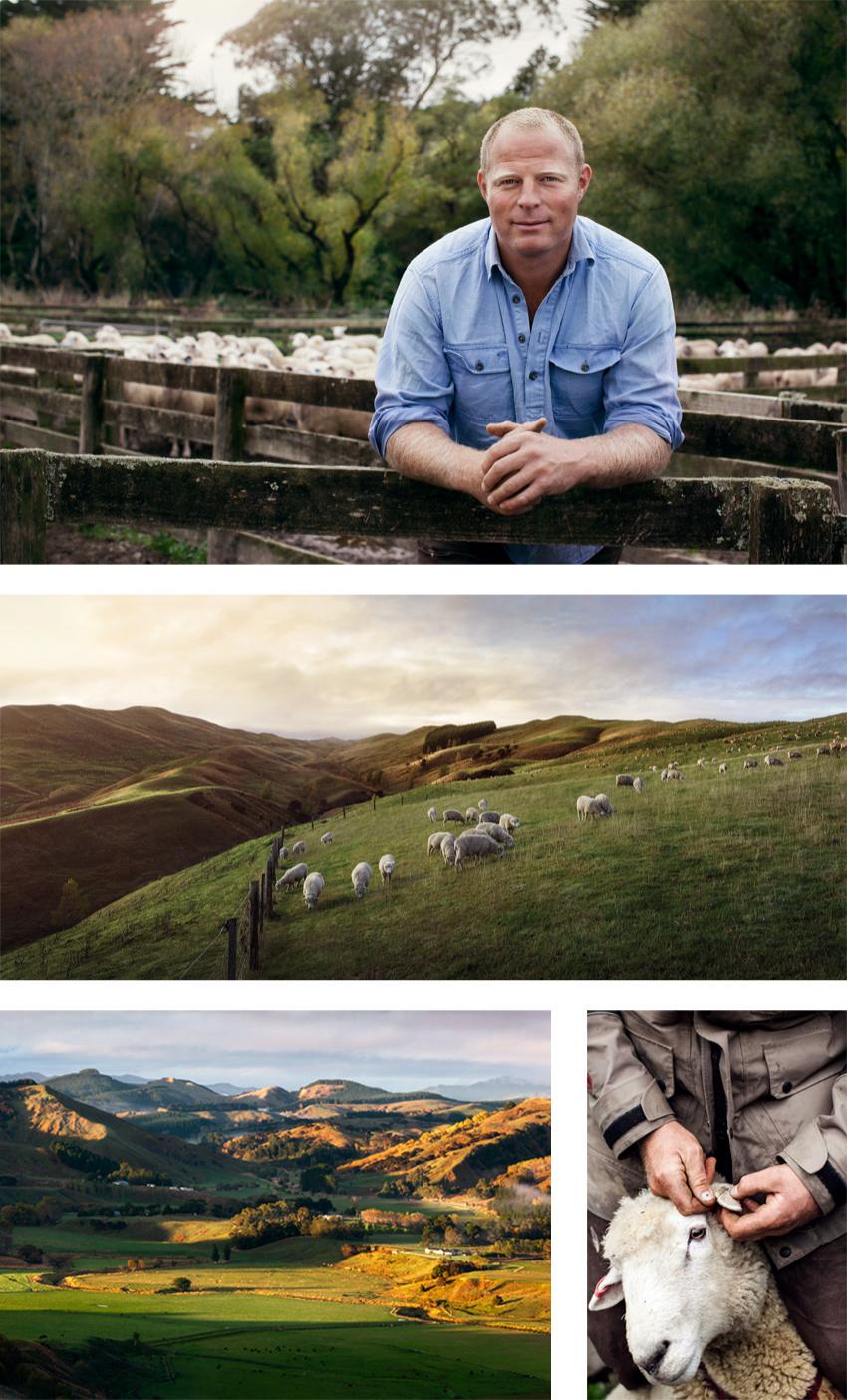
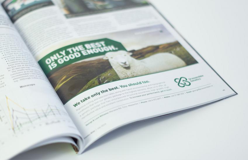
Grassendale Genetics stands for uncompromised quality. Highly superior genetics that exist through a tough selection process, sold by down-to-earth farmers that are easy to deal with. This was the basis that formed the brief that was handed down to us.
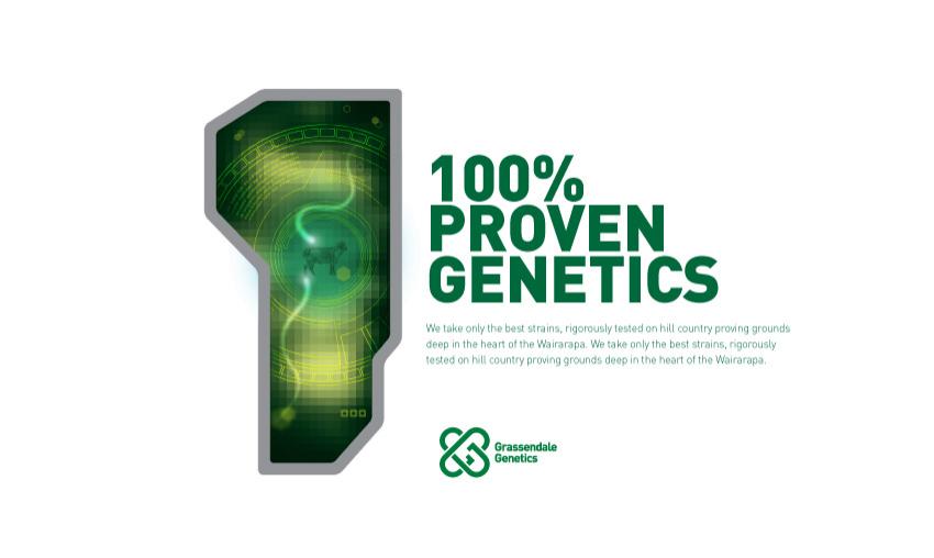
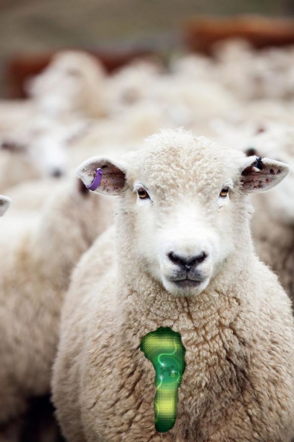
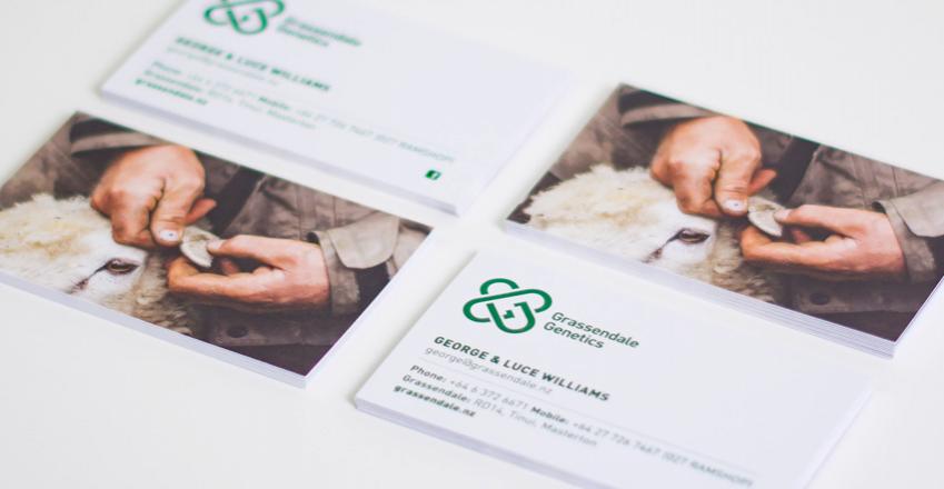
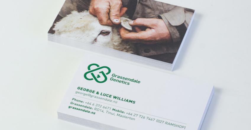
A tired and outdated brand identity prompted a new brand. Crisp, exact lines make up the interlinking G's of the logo, which represents the interlocking structure of DNA chains and molecules.
The dark green brand colour is an obvious link to the land. Dark in its appearance, rich in its connotations.
![]()
![]()
![]()